Choosing the right color palette is one of the most important decisions in interior design. Colors influence the mood, atmosphere, and overall personality of a home. A well-planned palette can make rooms feel larger, brighter, warmer, or more luxurious, while poor color choices can make even beautifully furnished spaces feel disconnected.
Whether you're decorating a new home, renovating an existing one, or refreshing a single room, understanding how to select the perfect color palette can help create a cohesive and inviting interior.
Start with Your Lifestyle and Personality
Before looking at color charts and paint samples, think about how you want your home to feel.
Ask yourself:
- Do you prefer calm and relaxing spaces?
- Do you enjoy bold and energetic environments?
- Do you like modern minimalism or traditional warmth?
- Do you want your home to feel luxurious, cozy, or vibrant?
Your color choices should reflect your lifestyle and personal taste rather than simply following trends.
Understand the Role of Color Psychology
Different colors create different emotional responses.
Warm Colors
- Beige
- Terracotta
- Warm white
- Mustard
- Soft brown
These colors create comfort, warmth, and a welcoming atmosphere.
Cool Colors
- Blue
- Sage green
- Grey
- Lavender
- Mint
These shades promote relaxation and tranquility.
Neutral Colors
- White
- Cream
- Taupe
- Greige
- Light grey
Neutrals provide flexibility and timeless appeal, making them popular choices for modern homes.
Consider Natural Light
Lighting dramatically affects how colors appear.
Rooms with abundant natural light can handle:
- Darker shades
- Rich colors
- Bold accent walls
Rooms with limited natural light often benefit from:
- Light neutrals
- Soft whites
- Pale earth tones
- Reflective finishes
Always test paint samples at different times of the day before making a final decision.
Use the 60-30-10 Rule
One of the most popular interior design principles is the 60-30-10 rule.
60% – Dominant Color
Usually applied to:
- Walls
- Large furniture
- Flooring
30% – Secondary Color
Used for:
- Upholstery
- Curtains
- Accent furniture
10% – Accent Color
Added through:
- Cushions
- Artwork
- Decorative accessories
- Statement pieces
This formula creates visual balance and harmony throughout a space.
Choose a Base Neutral First
Many professional designers start with a neutral foundation.
Popular choices include:
- Warm white
- Ivory
- Cream
- Beige
- Greige
- Soft grey
Neutral backgrounds provide flexibility and allow decor elements to evolve over time.
Draw Inspiration from Existing Elements
Sometimes the perfect palette is already present in your home.
Look at:
- Flooring
- Kitchen cabinets
- Stone surfaces
- Wooden finishes
- Furniture
- Artwork
Building a palette around existing features helps create a cohesive appearance.
Create Flow Between Rooms
A home should feel connected rather than fragmented.
Instead of using completely different colors in every room, maintain continuity through:
- Similar undertones
- Repeating accent colors
- Coordinated neutral shades
- Consistent materials
This creates a seamless transition throughout the home.
Embrace Earthy Tones
One of the strongest interior design trends in recent years is the use of nature-inspired colors.
Popular choices include:
- Terracotta
- Clay
- Olive green
- Sand beige
- Sage green
- Warm brown
These shades create a timeless and calming atmosphere while pairing beautifully with natural materials.
Don't Be Afraid of Accent Colors
Accent colors add personality and visual interest.
Consider using:
- Deep navy
- Forest green
- Burnt orange
- Charcoal black
- Burgundy
- Mustard yellow
Accent colors work best when used sparingly through decor and accessories.
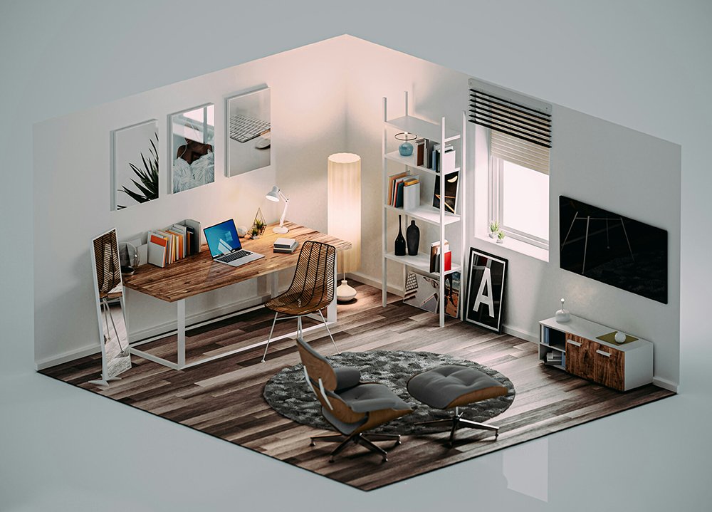
Match Colors to Room Function
Different rooms often benefit from different color approaches.
Living Room
Warm neutrals, earthy tones, and inviting colors.
Bedroom
Soft blues, sage greens, muted greys, and calming shades.
Kitchen
Fresh whites, natural wood tones, and subtle greens.
Home Office
Focused colors such as muted blue, warm grey, or olive tones.
Dining Area
Rich earth tones and warm colors that encourage social interaction.
Test Before Committing
Never rely solely on paint catalogs or digital images.
Always:
- Purchase sample paints
- Apply them to walls
- Observe them in natural and artificial lighting
- View them at different times of day
This helps avoid expensive mistakes and ensures satisfaction with the final result.
Use Texture Alongside Color
Color is only one aspect of design.
Adding texture enhances depth and richness.
Combine colors with:
- Wood
- Linen
- Stone
- Cane
- Metal accents
- Natural fabrics
Even a neutral palette can feel luxurious when paired with varied textures.
Find Inspiration from Real Homes
One of the easiest ways to discover color combinations is by exploring beautifully designed homes.
Seeing colors used in real spaces helps homeowners understand:
- How shades interact with lighting
- How palettes flow between rooms
- Which combinations feel timeless
- How accent colors are incorporated
Real-world examples often provide more practical inspiration than paint catalogs alone.
Discover Beautiful Color Ideas on Decorly.in
Decorly.in is a growing platform where homeowners, interior designers, architects, and decor enthusiasts showcase inspiring homes and interiors from across India.
Whether you're looking for:
- Modern color palettes
- Luxury home inspiration
- Earthy interior themes
- Minimalist designs
- Contemporary spaces
- Traditional Indian interiors
Decorly.in offers endless ideas to help you choose the perfect palette for your own home.
By exploring real projects and design showcases, homeowners can confidently discover colors that match their style and vision.
Showcase Your Home on Decorly.in
Have you created a stunning color scheme that transformed your living space?
Decorly.in allows homeowners and design professionals to showcase their interiors, share design journeys, and inspire others within India's growing design community.
Benefits include:
- Showcase your home interiors
- Build a design portfolio
- Share renovation stories
- Inspire other homeowners
- Connect with design enthusiasts
- Gain visibility within the interior design community
Every beautifully designed home can inspire someone else's dream space.
Final Thoughts
The perfect color palette is one that reflects your personality, complements your lifestyle, and creates the atmosphere you want to experience every day. By considering lighting, room function, existing materials, and design principles such as the 60-30-10 rule, you can create interiors that feel harmonious, stylish, and timeless.
If you're looking for inspiration, explore Decorly.in to discover real homes, creative color combinations, and interior design ideas that can help bring your vision to life.